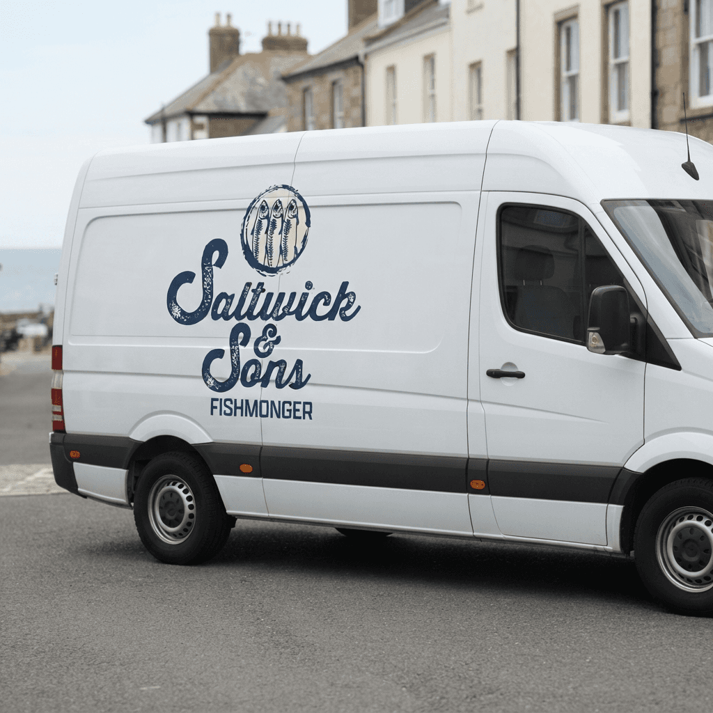
Saltwick & Sons

project overview
Saltwick & Sons is a heritage identity project for a third-generation fishmonger on the North Yorkshire coast, working from day-boats that land their catch within sight of the shop. I developed a wordmark, logo and combination mark built around a fish illustration, then carried the identity through a real-world application system: fish-wrap paper, brown paper bags, a shopfront frontage and vinyl window sticker, van signage, and a stamp. The brief was to make the brand feel genuinely old and earned rather than dressed up as "vintage", communicating provenance and daily freshness for an audience ranging from decades-long regulars to restaurant buyers sourcing for their kitchens, without ever reaching for the word "artisan."
project type
Brand Identity
my role
Graphic Designer
client
Personal Brief